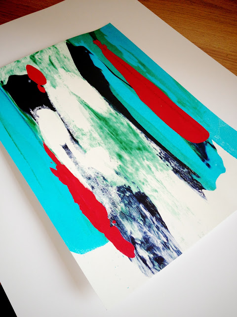
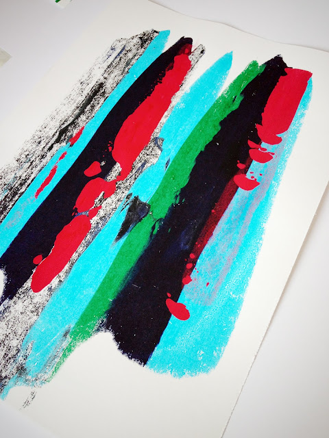
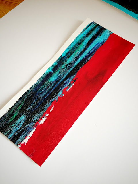
Above I have played with screen printing. I have used a few different binders to vary the opacity of the paint. I really love the sharpness of the red colour next to the flatness of the darker colour next to it. (picture directly above). At this point I am just experimenting with surface design, pattern and colour to explore what colour combinations I think will work, if the finals were to be for fashion or interiors.
My original idea was to create large scale samples for my graduate design show in June, however I have got to a point where I need to choose a direction because scale and textile material for final printing needs to be considered. It is such a difficult decision to make and commit to! I am hoping to make the fashion/interiors decision by easter. Another update soon bloggers!


No comments:
Post a Comment